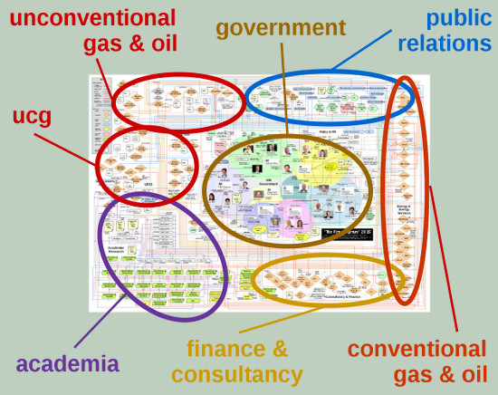
In July 2013 I produced a very rudimentary ‘map’of the connections related to un/conventional fossil fuels at the heart of Government. Finally, after two years of research, I have now produced the final detailed version – the Frackogram 2015 – an infographic which depicts the highly questionable relationships between policy-makers in Government, the industry developing fracking, and the finance and PR industries supporting them.
Introduction to ‘The Frackogram’
This is complicated… no, I mean this is really complicated!
Sorry, but there is no summary available. The ‘frackogram’ is a representation of a complex set of relationships which, together, create a “web of influence”.
After so long looking at this issue, and all the connections within Government and the industry supporting unconventional gas and oil in Britain, what I see in my head is a three-dimensional data structure which represents a complex network of connections and data which describes them.
The Frackogram 2015 takes the ‘surface layer’ of organisational relationships – stripped of their interactions to technologies, development sites and/or environmental impacts – and tries to represent them as a two-dimensional ‘map’ which others can more easily (!) browse.
What the ‘frackogram’ shows is data; large amounts of data. To fully understand the relationships depicted within the map you have to learn more about the entities shown. That requires quite a few hours of study. That is the purpose of this page – to support those who want to use the ‘frackogram’ to delve deeper into the network of support for unconventional gas and oil in Britain.
If funding were available in the future, it would also be possible to make similar graphical correlations showing the web of academic research, or companies and their development sites/environmental records. That is, however, a completely different project to what is shown here.
Download ‘The Frackogram 2015’
You can print out the ‘frackogram’ at A4 size, but it is barely legible. To even begin to attempt to study it you need to print it out at A3, preferably in colour, and even then the lines are still a bit tight.
For detailed study I recommend you get it printed at A2 size. To get the best effect, as a wall poster, you really need to view it at A1.
The simplest option is to download the files below, put them on a memory stick/card, and then go to your local copy shop and get them printed out in colour at the biggest size you can afford.
You can download the ‘frackogram’ in the following formats:
- A3-size PDF – the smallest practical size to study content the ‘frackogram’;
- A2-size PDF – the best practical size to study detail the ‘frackogram’;
- A1-size PDF – the best size for reproduction as a wall poster;
- SVG file – a ‘scalable vector graphic’ file, allowing you to import and rescale the ‘frackogram’ to any size without losing quality.
Revisions:
The ‘frackogram’ is not intended to be a static work. It will be occasionally revised and updated.
The black name label near the centre of the image gives a version number, e.g. ‘1.2’, and the date of the last revision/update. Every time there is a minor revision the second of the two digits will by incremented. A wholesale revision is indicated by a change in the first of the two digits – not likely unless there is a major change in Government or a major reorganisation of the industry in the UK.
The structure of the ‘frackogram’
As you scroll across the ‘frackogram’, and move the mouse pointer, you will see different labels displayed in the floating bar at the top of the screen. These labels highlight ‘hot’ areas of the image – clicking on a highlighted point on the image will open another tab or browser window (depending how your browser is configured) with further information about that element of the image.
However, the purpose of the ‘frackogram’ is not to show entities or organisations; the ‘frackogram’ illustrates the relationships between organisations, and the nature of those relationships.

If you look at the entities/organisation, it does not mean anything (that is the common mistake people make when first viewing the map). The value is in understanding how these different entities are linked together.
To aid that the ‘type’ of the entity is indicated by its shape; the ‘nature’ of the relationship is indicated by the colour-coding of each line; and where there are special features about that relationship, the line has a text label.
As shown in the key on the left, the entities are fairly self-explanatory.
The lines are a little more complex.
Current relationships are shown by solid lines; significant previous relationships are shown with dashed lines. There are also limitations within the use of lines – for example employment, finance and investment are shown in the same orange colour. Arguably the same could have been done for academia or PR because it is based on finance/employment, but different colours are used because the purpose of that relationship is distinct.
The structure of the ‘frackogram’ has been likened to a printed circuitboard (and yes, to answer a question I’ve been asked a lot lately, I used to design them as part of my electrical design work). This allows different types of entity to be grouped together, with a ‘trunk’ of connections orbiting the central ‘government’ bubble.
This arrangement does make for more lines, but it does allow an easier comparison of the role or purpose of the entities in the network.
In order to make the best use of the ‘frackogram’ you either need two display screens, or a single screen and a paper copy in front of you.
On one screen/the paper copy you trace the lines with your finger; on the other screen you can use the ‘frackogram’ browser window to scroll across the image, and then click on the entities/labels to find out more about them.
As you move the mouse pointer across the screen you’ll see the ‘hot’ areas of the map display a title showing what the link connects to. Clicking opens up multiple tabs/windows (depending how your browser is configured) allowing you to view information on multiple entities – so that you can compare and contrast by switching between the tabs/windows.
Sorry, after various attempts and trialling them with some volunteers, this is the simplest way to show the data involved with the least amount of computer resources. That is because this is a large set of complex inter-related relationships – and the reason they’re difficult to see is precisely because they’re complex.
Subject ‘masks’
The ‘frackogram’ is a complex image because it contains so much data. To aid interpretation what the on-line ‘frackogram’ browser can do is apply a ‘mask’ – a translucent screen to blot out all but those parts of the diagram relating to a specific issue.

Just below the information line of the floating display is a drop down menu. This allows you to select the mask to display the parts of the ‘frackogram’ which relate to a specific issue.
Currently there are ten options on the menu (note – you can also download an image of the ‘frackogram’ with the mask applied to it):
- ‘No mask’:
This shows the full diagram without any areas blanked out.
Download Frackogram 2015: ‘No mask’ image - ‘Task Force on Shale Gas’:
This mask highlights all the elements associated with the Task Force on Shale Gas.
Download Frackogram 2015: ‘Task Force on Shale Gas’ image - ‘APPG on Unconventional Gas and Oil’:
This mask highlights all the areas associated with the All Party Parliamentary Group (APPG) on Unconventional Gas and Oil.
Download Frackogram 2015: ‘APPG on Unconventional Gas and Oil’ image - ‘Task Force on Shale Gas and APPG on Unconventional Gas and Oil’:
This mask highlights both the Task Force and APPG elements in order to show the commonalities between them.
Download Frackogram 2015: ‘Task Force on Shale Gas and APPG on Unconventional Gas and Oil’ image - ‘Shale gas/oil and coalbed methane operators/financiers’:
This mask highlights the shale gas/oil and coalbed methane operating companies, the larger petroleum companies financing their operations, and the public relations agencies representing them.
Download Frackogram 2015: ‘Shale gas/oil and coalbed methane operators/financiers’ image - ‘Underground Coal Gasification Association/supporters’:
This mask highlights members of the Underground Gasification Association, and other organisations associated with/supporting UCG.
Download Frackogram 2015: ‘Underground Coal Gasification Association/supporters’ image - ‘NERC CDT in Oil and Gas’:
This mask highlights the Natural Environment Research Council’s (NERC) Centre for Doctoral Training (CDT) in Oil and Gas &ndask; and part Government, part industry funded partnership supporting academic research – including the sponsors and the participating institutions.
Download Frackogram 2015: ‘NERC CDT in Oil and Gas’ image - ‘Fossil fuel financed academia’:
Though not an exhaustive list, this mask highlights the larger industry-funded research projects and instituted in academia, primarily focussed on fossil fuels production/exploitation.
Download Frackogram 2015: ‘Fossil fuel financed academia’ image - ‘Politics and public relations ‘revolving door’:
This mask highlights the ‘revolving door’ connections between selected Government ministries, ministers, and public relations companies.
Download Frackogram 2015: ‘Politics and public relations ‘revolving door” image - ‘Politics and policy ‘think tanks”:
This mask highlights the relationships between selected Government ministries and the policy think tanks which have connections to key ministers.
Download Frackogram 2015: ‘Politics and policy ‘think tanks” image
Click here to go to the ‘frackogram’ browser window.


1 Comment
Wow!! I bet that even those within the industry will be printing out your A1 size Frackogram for their office walls!